What do models learn? (Part 1)
This is the first of a multi-part blog trying to dive a bit deeper regarding what machine learning models actually learn from the data that they are being trained on.
Today’s machine learning and artificial intelligence (AI) domains dominate the landscape of many industries, where the question usually is “what more can we do with data to accomplish some goal?”, which is fed into a complex model to match against a specific pattern. Such models are so well optimized with so many layers to focus them towards a specific patterned goal, that the internals are difficult to explain. So when asked “how does this model perform this goal, and what has it learned from the data“, those questions are becoming more difficult to answer through clear and simple concepts. Throughout this series of blogs I am hoping to uncover this for a wide audience – with any complex mathematics gently explained through simple analogies – as I keep running into these questions, but have not seen them well-presented without losing the reader through obscure, domain-specific terminology. These topics will be divided into bite-size blogs, so as to not to overwhelm the reader or lose any audience members. I will try to apply it to multiple fields as to make the material welcome to a variety of wide breadth of interested readers. I will begin with a focus around the area of Deep Learning, which has become mysterious to many to explain precisely the meaning behind the effect of how they internally operate on the data to provide the given results. With time I will expand to other areas of machine learning and artificial intelligence.
Problem State Representation Through Values
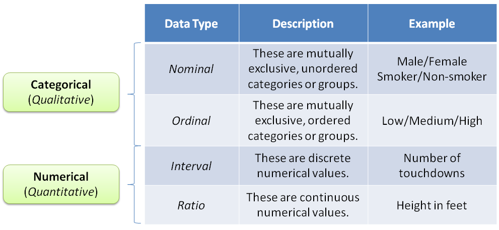
Most problems are easiest defined by the state they present themselves in. The easist way to communicate that state is through values, and the connections among values. The reason values present the best representation is because the analysis of values provides the best flexibility with our current domain knowledge towards insight of transforming problems towards solutions. The simplest types of data types are either qualitative or quantitative, as shown in the table below:
As an example of a dataset to start with, let’s use the following simulated data of patients’ temperature and condition. We will eventually build a model that will predict using temperature if they might be either sick or healthy.
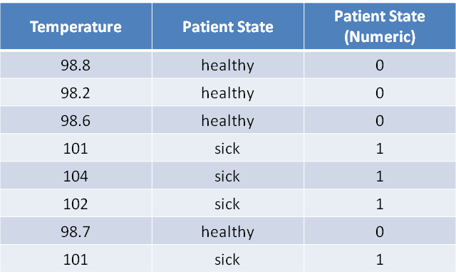
Assuming the data is clean – a topic I will cover at a later time – we can assume there is very little variability in the representation of the data and the reality of the true model the data captured. One has to assume there is a model operating in nature that we inspect with our instruments, to capture the representation of its state in the form of values. If there are minimal perturbations between the model and the instruments capturing its state, we assume the data contains minimal noise (error). For now we will assume that in order to capture the larger concepts of a simple model.
Identifying State Separation in Data
In our simple example, we simulated body temperature in trying to predict the state of patients (i.e. sick or healthy). The simplest approach to start with is to plot the data, and see what trends might exist:
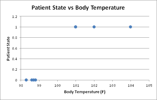
A clear nice vertical separation between the healthy and sick patients exists at a threshold value of 100° F:
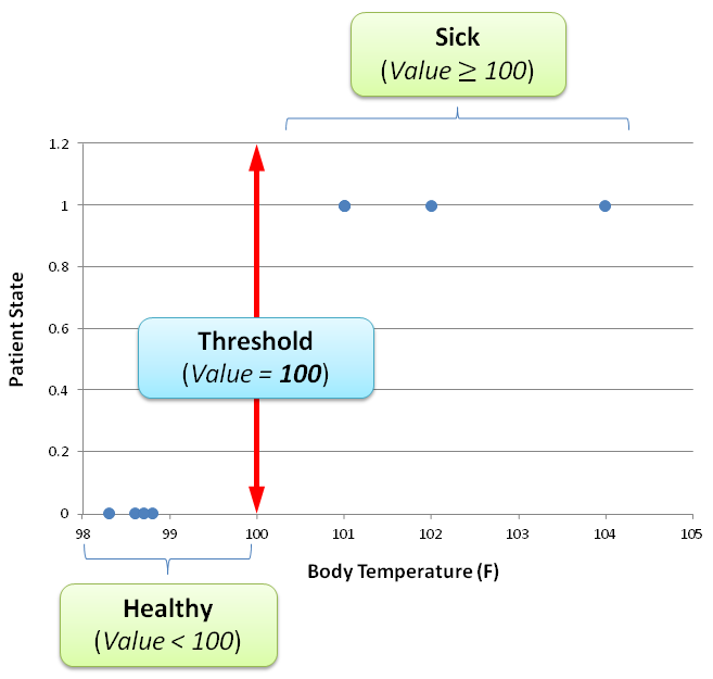
Of course this is a very simple threshold that had chosed based on visual inspection, but it will help us with demonstrating the next step in the model. More complex models will be presented later where a clear threshold will be a bit more difficult to select for.
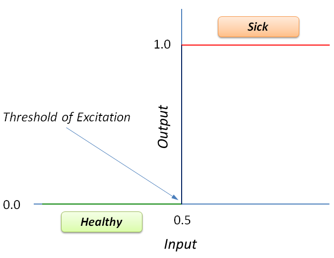
One thing that would make the separation a little easier to manage is to rescale the data between 0 and 1. The simplest approach would be to divide the input values by 100 (or multiply by 1/100) and then substract 0.5. Then the threshold value can be 0.5, and then we can label anything above 0.5 with a 1 (sick), and anything below with 0 (healthy).
The Mathematical Neuron Model: The Perceptron
Most models today apply a concept of Deep Learning upon data to learn similar to how our brains function. The idea came from studying how our brains work. The general concept is that we have at the core neurons, that receive an input signal and produce an output signal as follows:
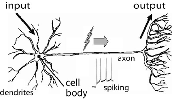
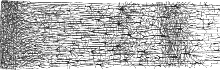
A neuron receives input signals from other connected neurons, and traverses the axon to generate an output signal. Our brains have many layers of connected neurons to perform a decision or identify a pattern:
Given the above, a neuroscientist and a logician – namely Warren S. McCulloch and Walter Pitts – wrote a paper in 1943 called “A logical calculus of the ideas immanent in nervous activity” in the Bulletin of Mathematical Biophysics
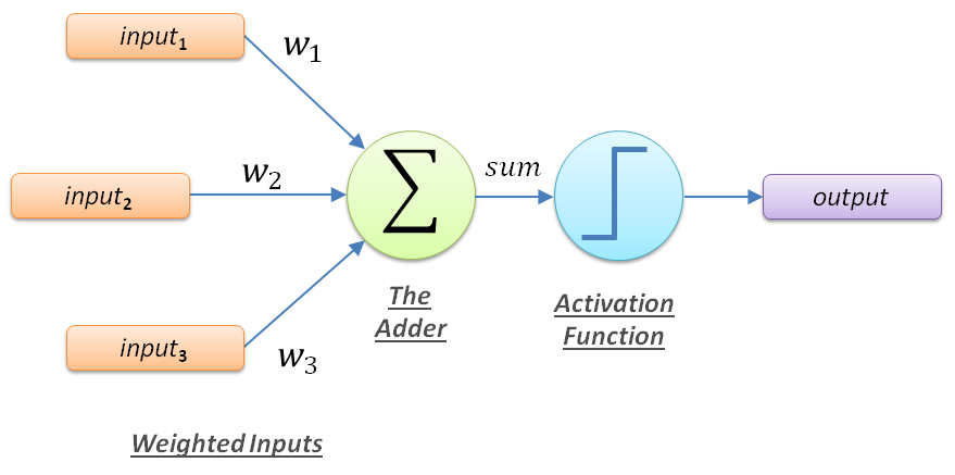
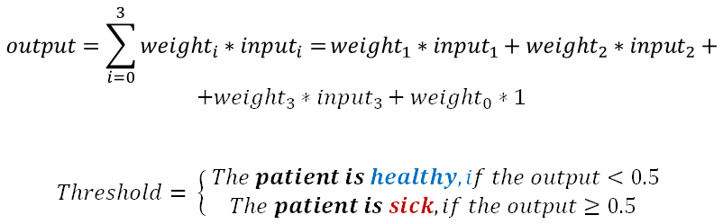
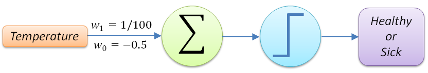
The idea is that the inputs (temperature) can be multiplied by adjusted weights and then summed up – via the adder function – such that based on a threshold (activation function) the output (sick or healthy) can be determined. The mathematical representation of this would be as follows:
The threshold function operates in our case by activating to the appropriate output based in the given input:
The idea is that the inputs (temperature) can be multiplied by adjusted weights and then summed up – via the adder function – such that based on a threshold (activation function) the output (sick or healthy) can be determined. The mathematical representation of this would be as follows:
For our patient example, the perceptron model can be simplified to the following:
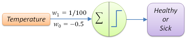
The above perceptron usually is presented in the following compacted form (which we will use from now on):
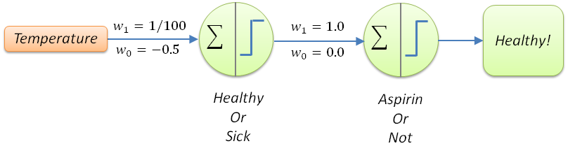
The next question for extending our model to make it more useful would be to answer the following question: “Should the patient be provided an aspirin regimen or not?”. This is based on the assumption that the model assumes this whole decision is based only on body temperature. The way we can do this is to extend the model by a deeper layer with another perceptron:
We have now created our first neural network – or simple deep neural network – but the question we still need to answer is, what did this neural network learn? In short what these weights perform is the neuronal firing pattern to label across a decision boundary either sick or healthy. This is driven by the pattern in the input data – thus the input data decides which neurons should fire, activating those weights. But still, that feels confusing!
If we look carefully at the behavior of these weights, they act as vectors – something I’ll cover later in greater detail – to rescale the space the data is represented in, in order to have a better separation criteria for selecting between the sick and healthy category (label) for each patient. So w1=1/100 re-adjusts all the values – together with the bias term (w0=-0.5) – to fall roughly between 0 and 1 by ensuring that values less than 100 fall below the 0.5 threshold, while anything above are over 0.5. If you look carefully, the decision boundary of Temperature=100 (or x=0.5 after rescaling) is at a 90° (right angle) to the points:
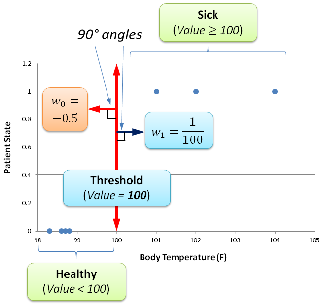
What this rescaling of the space actually does, sets the minimum input activation value (of 100° F) for activating the decision towards sickness. If the input is below the threshold of 100° F, the perceptron is below the activation barrier of labeling the patient into the sick region of the space, thus remaining within the healthy region of the space.
Thus a model in the most simple terms reshapes the data as a whole (in order to preserve its representation of reality) for properly finding discriminating lines for creating labeling boundaries. These labeled boundaries then become the categories (labels) for classifying the input data into a decision about how to move forward based on this information.
We will explore each of these ideas in greater depth in the upcoming blogs, but I hope this gives you a glimpse of what models actually learn about the data they are trained upon.